Dot Dot Dot Exhibition
A Solo Exhibition on Design with Data
Dot Dot Dot was a solo exhibition at The Sheffield Institute of Arts from 13th February – 30 March 2014.
The show comprised of many different kinds of objects – from large prints, to electronic hardware to 3D printed pieces, yet all derived or making use of data in some form or another.
Full list of exhibits:
Breathe
Breathing lights communicate the current air quality in Beijing. Calm, steady breathing indicates good quality air, whilst the faster the breathing the more hazourdous the air for the population of China's capital city.
Data source: US Embassy Beijing Air Quality Monitor
Fuzzy Weather Indicator
Laser-etched icons display an hourly overview of the current weather forecast for Sheffield. Updates every hour.
Data source: Weather Underground
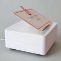
Box of Tweets
Brendan's Twitter archive is stored in a dedicated digital box. Turning the control backwards or forwards lets you traverse several years worth of tweets.
Data source: Twitter
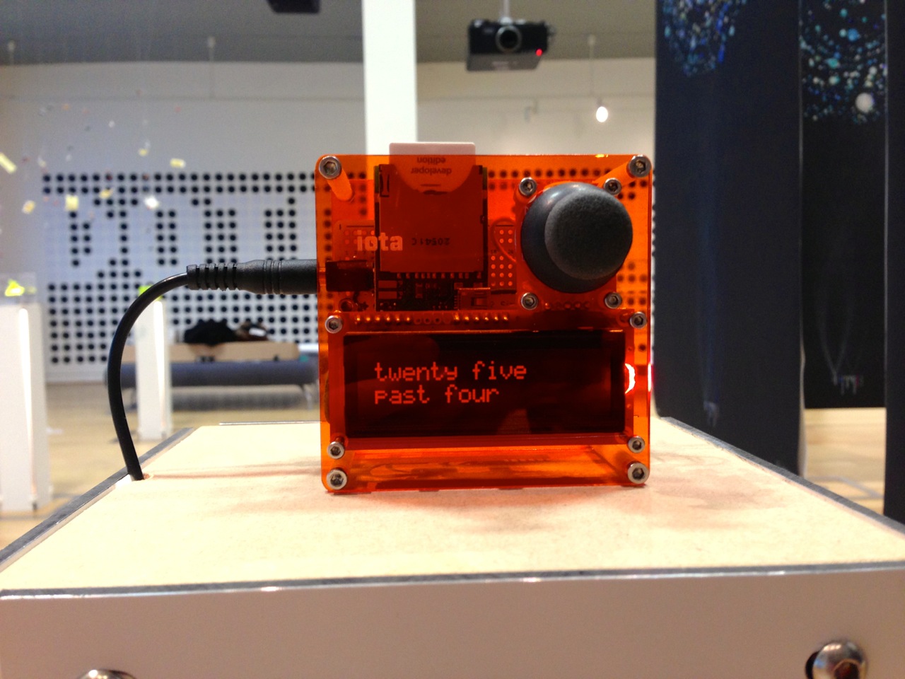
IOTA
A digital display agnostic to the data it receives. Moving the joystick left or right changes the mode of the device, from a clock, to a weather display, to the latest news headlines to Twitter. Moving the joystick up and down lets you scroll the text.
Data source: Yahoo!, BBC News, Twitter
The Happiness Machine
Pressing the button prints a random thought from a random stranger who happened to mention to the word "happy" somewhere on the Internet. Tear and share.
Data source: We Feel Fine
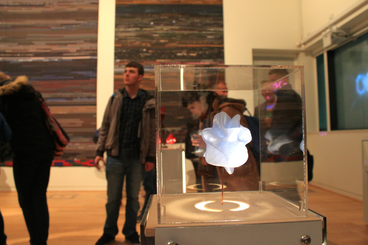
Moments in Music
Moments in Music is an experiment in creating real-world physical moments from digital music. Using specially written software, songs are analysed to then create momentary snapshots, producing a 3D model of a specific moment which is then printed on a 3D printer.
Each piece is unique, formed from data derived from sound waves.
Data source: mp3
Red model - LCD Soundsystem - Losing My Edge
Blue model - Bob Dylan - Subterranean Homesick Blues
and then the three that are together are:
Pulp - Common People
Arctic Monkeys - I Bet You Look Good On The Dance Floor
The Human League - Sound of the Crowd)
Apollo 11 Transcript Static
Created for the 40th anniversary of the 1969 Moon landing, the entire Apollo 11 transcript creates typographic static, whilst the infamous phrase cuts through all the noise.
Data source: NASA
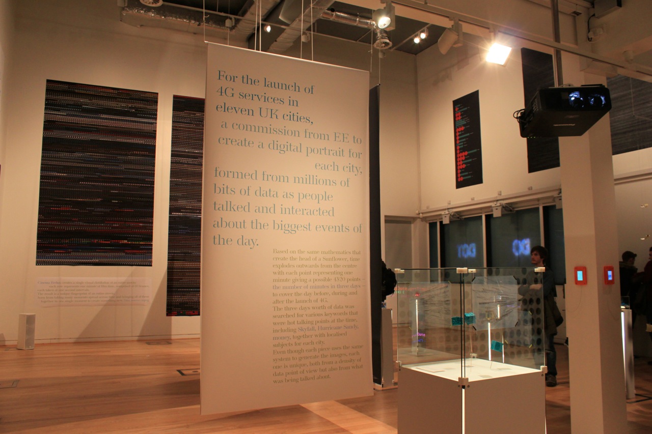
Cinema Redux
Cinema Redux creates a single visual distillation of an entire movie; each row represents one minute of film time, comprised of 60 frames, each taken at one second intervals. The result is a unique fingerprint of an entire movie, born from taking many moments spread across time and bringing all of them together in one single moment to create something new.
Data source: mpeg
The Spy Who Killed Me
To celebrate the fiftieth anniversary of Dr. No, an image showing the number of kills by James Bond in official movies. Large circles represent ten kills whilst small circles represent one. The image pays homage to the wonderful opening titles to Dr. No by Maurice Binder. Bond only killed one person in The Man With The Golden Gun yet seemed to go a little crazy in GoldenEye...
Data source: The Guardian
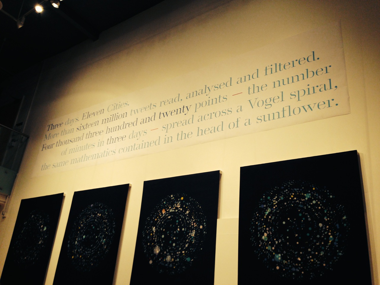
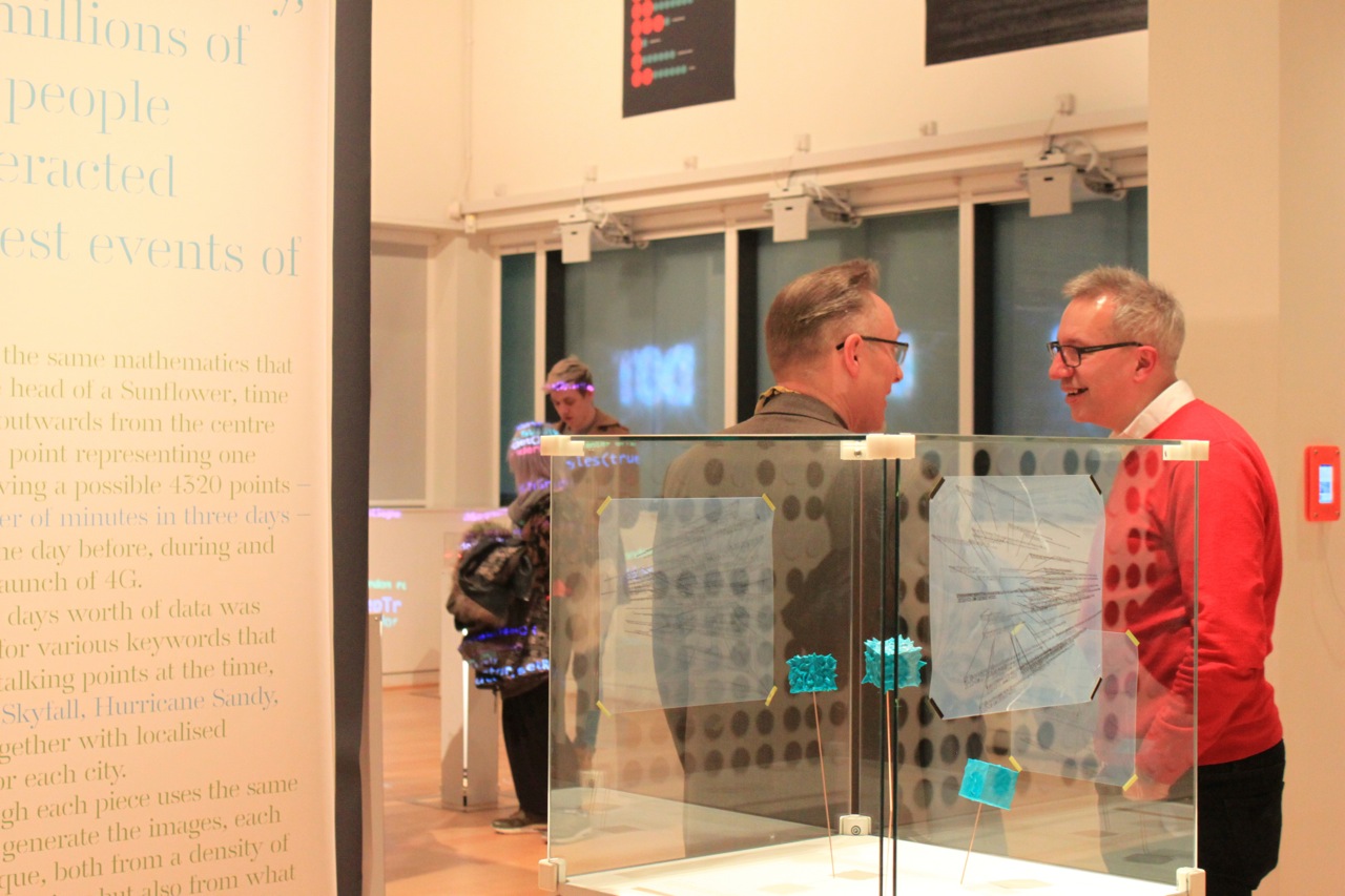
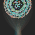
EE Digital City Portraits
For the launch of 4G services in eleven UK cities, EE commissioned Brendan to create a digital portrait for each city, formed from millions of bits of data as people talked and interacted about the biggest events of the day.
Based on the same mathematics that create the head of a Sunflower, time explodes outwards from the centre with each point representing one minute giving a possible 4320 points – the number of minutes in three days – to cover the day before, during and after the launch of 4G.
The three days worth of data was searched for various keywords that were hot talking points at the time, including Skyfall, Hurricane Sandy, money, together with localised subjects for each city.
Data source: UCL, Twitter
Kennedy: Capture the Now
A new way to mark moments in time complete with surrounding context of the things happening around you.
With a single tap Kennedy captures layers of a moment including location, date and time, weather conditions, latest news headlines together with music you were listening to.
All the data that Kennedy captures can be exported for use in data visualisations.
Data source: you, RSS, Weather Underground, Foursquare
Now Next Later
Now Next Later is a subtle weather app for iOS that shows the weather for any number of locations around the world.
Instead of the expected weather icons, Now Next Later uses a cross based particle system to show current conditions including rain, wind speed, clouds and snow.
Data source: Weather Underground
Accidental News Explorer
The Accidental News Explorer celebrates chance encounters and serendipity.
Start by searching for a subject. Once you've browsed the suggested articles taken from hundreds of news sources, tap the “related topics” button to discover connected topics, which in turn lead to more articles.
Each article leads to new things; the more curious you are, the longer your journey will be.
Data source: various news sources
Data Cubes
What can data look like when it's physical? Using Brendan's Twitter archive for 2008 - 2012, activity is mapped across the cubes, distorting the surfaces to reveal the amount of tweets on that year.
Data source: Twitter
Thank you Pam Bowman, Philips Robbins and Lisa Brammah-Dawes for the photos.shorturl: http://daweso.me/1iJYuv0


Created in 2012
Other “Dawesome” Things

Sign-up for the Dawesome Digest
Get in touch to talk about working together